A Holistic Guide to Marketing Page Optimization
When people talk about optimizing their site, they could mean a few different things. Are they talking about performance? Are they tracking a certain engagement, such as email signups or clicks on a call-to-action? These go hand in hand. Bugs and performance issues will cost you sales and signups. The same goes for Usability. The harder your site is to use, the less it will be able to help others. Accessibility is too often ignored by developers and stakeholders, but accessibility isn’t just for those that are differently abled. More accessible sites
When it comes to optimizing a page, that means you can’t focus on a single metric, you have to look at everything:
- Is the information in an architecture that makes sense?
- Is the copy persuasive and speaking towards to target audience?
- Is the text readable?
- Is the site performant?
- Does the site load, without errors, on all devices?
- Is the site usable and accessible?
Before optimization is made, the decision has to be made: Do you want to improve on what’s already there, or build something new from scratch? In most cases, I’d argue that you would prefer to work what’s already there. This allows you to iterate and get improvements out the door faster. We tend to underestimate the cost of starting a new project from scratch. A site has to be in some kind of state before I’m willing to declare bankruptcy and start from scratch.
Here’s how I tackled updating a single page landing site. You can apply these techniques to your own sites or future projects.
An Optimization Case Study
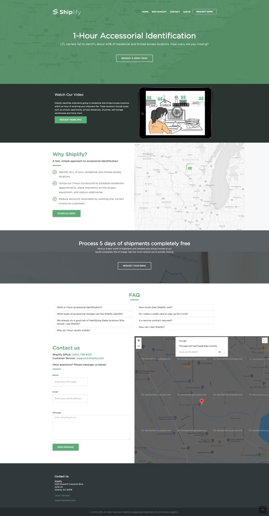
Before
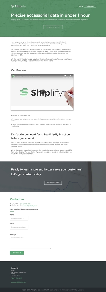
After
Starting With Narrative
One of the impetuses of this project was that no one had touched the marketing site in a couple of years. As a fast-moving company, the original messaging had grown stale and unreflective of where the company was today. It was time to take stock of who we were, what problems we solved, and who we aimed to help.
Most marketing pages make the mistake of being selfish. Here I am, here’s my product, here are its features, and here is my call to action, isn’t it awesome?
The world has enough of those marketing pages. That’s not a story worth telling.
Marketing pitches need to be thought of from a perspective of the reader first and followed then by service. No one cares about you, or your product. they care about themselves, and the problem you aim to fix.
What we want are structure and narrative. All landing pages should tell the same story. In 30×500 it’s called “Pain-Dream-Fix”. I call it the “infomercial pitch”:
Hey, you know ${PROBLEM}? Does that stem from ${ROOT_CAUSE}? Imagine your life without it! Well, now you can have that life with ${SOLUTION}! ${SOLUTION} will solve the problem, despite ${COMMON_OBJECTIONS}!
Go watch any infomercial, and you’ll see some version of that story in the first 45 seconds. We aren’t the main character in our story, our customer is Our product is either the Yoda to their Luke Skywalker or their Ocarina from Legend of Zelda: Ocarina of Time.
How do you decide what your narrative should be?
Every Rewrite Starts With Research And Plain Text
Before we start rewriting, it’s time to see what we know. Open a Google Doc and start taking notes on the following.
- Who is your target audience?
- In what context would they be reading this page?
- What problem does our solution solve?
- What is the life of our customer like after they’ve implemented our solution?
- What are the common objections people have?
- What makes our solution unique compared to competitors?
Our target audience is people in a specific segment of the logistics industry. For this reason, I’m comfortable using insider lingo and slang terms. This shows that we know how to “talk that talk” and can build trust.
They are typically reading this at some midpoint in the sales cycle. So, we don’t have to worry as much about the “What is our product / What is your pain?” questions and we can focus more of the “Why you should solve your problem this way.” part of the equation.
Answering questions like common objections and unique selling propositions may have been answered in existing material, such as brochures or sales scripts. We don’t get points for originality, we get points for effectiveness.
Once we’ve figured out the broad strokes, we can zoom in on the smaller but important bits of copy: Headings and calls to action.
Optimizing The Microcopy
How do you start optimizing small bits of copy? By iteration. Start thinking of several variants to each piece of the copy. Sky’s the limit. Here are a few principles from Breakthrough Advertising to help you get started:
- The more specific you can make claims, the more they resonate.
- Can you explicitly measure the size or speed of the claim?
- Sensitize the claim by making the reader feel, smell, touch, see or hear it.
- Stress the exclusivity of the claim.
- Try rephrasing the heading as a question, paradox, or challenge for the reader.
- Add urgency to the claim.
- Ensure that benefits are not phrased as problems, and vice versa.
If you want a fun exercise, try going to your webpage and try rewriting headlines and calls to action with some of these ideas in mind. For example, the site originally used the phrase “request a free trial.” That was inaccurate as it was more of a high touch sales process and personalized demonstration of the software. Instead, this was rephrased as a “free consultation.”
Once you feel good about what you have to say, and I cannot stress this enough, not before, It’s time to start thinking about how you’re going to say it, and what it’s going to look like.
Crafting Design That Supports Copy
I write in a simple text editor. This helps me focus exclusively on content and copy. By working in HTML or a rich text editor, the text gets muddled with design, and compromises are made in the content at the service of the aesthetics of the site. Both are weaker for it. The aesthetics of the site should support the message, not the other way around. I’d rather remove or replace elements instead of creating content just to fill them.
First, it means placing a priority on readability. People are constantly distracted online, which hinders their literacy at that moment. Make your text as legible as possible. Some rules of thumb for more readable text.
- Keep all text left-aligned and single column.
- Maintain a high-contrast ratio between the text and background.
- Keep the line length at 90 characters maximum.
Once we’ve taken all of this into account, It’s to make sure that our site performs well. Every tenth of a second added to a page load decreasing the chance that people will read your site, much less convert. There are two main levers you can pull to improve your performance: Eliminate items that decrease page speed and increase page weight, or improve the ones that remain. Let’s look at each, starting with minimizing the existing page.
Optimization: Addition By Subtraction
Every element on the page must make a case for its existence. The question you should be asking is “why should we keep this?” not “Why should we remove this?”. The second question has a default answer: Every element on the page provides the reader with more distraction, cognitive load, and page weight. Nothing is free. If any part of the page isn’t pulling its weight, it needs to be removed.
Let’s start at the navigation. This example is a single page site (If you don’t count the free consult form and tertiary pages like privacy policy). It contained a home button, but we also use the logo as a home button. That can go. In fact, all of the navigation besides the call-to-action and the log in button for existing customers can be eliminated.
Elements that don’t support the pitch are cut as well. We do not need a “meet the team” section, as the team is immaterial to the customer and problems they face. We do not need a map next to the contact form, an address will do. That means no more loading all the Google Maps scripts, so big win there. FAQ Section? Many were not so frequent, and we can address other questions with the copy itself.
With new persuasive copy and a lighter look, it’s time to start optimizing the page, so that people can read it as fast as possible.
Optimizing For Performance
Performance is important for a number of reasons. It is a well-documented fact that page speed has a direct effect on conversion rates. In addition, our research has shown that our potential audience is constantly in contexts where they are using older browsers and machines or may be on a mobile device in a remote area with poor service. So its time to start cutting the page down.
There are a million different tactics, tips, and tricks to optimize web performance. It is a very deep rabbit hole where you quickly hit diminishing returns. For now let’s focus on what can get us big wins without doing a ton of work or restructuring the page: Everything we can do to see less data or the line and do so in fewer requests.
To start, we can remove a lot of the theme cruft we’ve inherited. This page was loading five different JavaScript libraries that were not being used. As mentioned earlier, we were able to cut other dependencies like Google Maps. This theme also had several CSS configuration options that were of no use, so we can cut down on a lot of the CSS.
We can further reduce the page weight by ensuring that our images are optimized. For this I like to use ImageOptim for images and OMGSVG for SVGs.
After we’ve done these page weight tactics. There’s another two great tools available for free, and one of them is built right into your browser. First, there is Lighthouse inside of Google Chrome. It can also help by simulating mobile devices and slow internet connections. The other is YellowLab. Both of these tools can give you specific feedback on how to make your website load faster. Running your site through these can give you some other ideas for where you could find some improvement.
Performance By The Numbers
| Before | After | |
| Requests: | 90 | 30 |
| Page Size: | 1.6MB | 1.3MB |
| DOMContentLoaded: | 867ms | 640ms |
| Load Time: | 1.96s | 1.32s |
| Lighthouse Performance Score: | 57 | 97 |
| Lighthouse Accessibility Score: | 69 | 70 |
| Lighthouse Best Practices Score: | 67 | 80 |
| Lighthouse SEO Score: | 89 | 100 |
Post Mortem
As you can see by the scores, there is still work that could be done. However, at some point, you start to hit diminishing returns on performance. Since we serve a small, targeted audience with a high touch sales process, optimizing this will only bring so much value. Compared to the price of doing a full-scale redesign, this approach nets a higher return on investment.